 |
|
Images From Contrast
Masking Workshop Participants
|
|
Mark Larsen
|
 |
 |
|
Final Print (after masking) |
|
|
e-mail
|
|
|
I used a CRM to bring up the shaded part of the house to the right of the tree, the shadows within the tree bark, and the shaded stone foundation to the left of the tree. I then used a SCIM to make the wreath black, and to strengthen the deepest values that were brought up by the CRM (deepest tree bark values, some rock foundation cracks,.and some parts of the house. Finally I used a fog mask (the type with non-image forming light) to gray down the white sky. Mark Larsen
This is a great example of how the right masking methods, applied judiciously and with a good deal of forethought, can vastly improve a photograph. Mark knew what he wanted out of this image, and that's at least half of the battle to achieving a good print. The straight print lacks rich, luminous values and does not have a very tactile quality. Most photographs exhibit these problems: dark, lifeless shadows, burned out skies, gray midtones. Merely changing paper grades or developers simply cannot overcome all of these plagues. Mark's use of a CRM had a two-fold effect: it raised the dark shadow values, opening them up so that the local detail could be "worked on", and it increased the edge sharpness on the entire image. The SCIM brought life into the raised shadows, and all of the midtones as well. His use of a type 1 Fog Mask was the finishing touch. It darkened the sky, even between the tree branches, making the sky darker than the white painted eaves and rooftop. Lynn Radeka |
 |
 |
|
Final Print (after masking) |
|
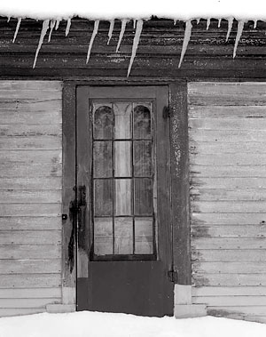
This scene was low in contrast and very flatly lit. Although I liked the content, I didn't think there was much potential for a strong print. I brought it along to the masking workshop and got an eye-opener in how to transform an image through masking. The selective contrast improvement achieved through masking completely changed the image. I don't see how it could have been done without the use of masks. Mark Larsen
At the June 2007 workshop we used this image of Mark's as an example of highlight masking. Our intention was to brighten the icycles and the central light area of the doorway. We designed a highlight mask and bleached out any areas on the mask that we didn't want affected, leaving only the icycles, doorway detail, and the chipped paint to the right of the door. The mask worked perfectly and the icycles and door detail took on a brilliant glow. The highlight mask brightened AND increased the contrast in these local areas only, leaving everything else untouched. We also burned the edges to balance the overall image on the final print. Lynn Radeka |
|
|